Posted on Programming

Conan Exiles Enhanced – Food tool

A few months ago Conan Exiles switched to Conan Exiles Enhanced, so I rebuilt my More Levels Pls mod for it as More Levels Pls Enhanced, which, honestly, is exactly the same except that I built it using the Conan Exiles Enhanced UE5 Dev Kit, instead of the Conan Exiles UE4 Dev Kit. I guess I also changed the level cap from 250 to 291.

But that’s neither here nor there, for what I wish to speak at you about today is food.

In Conan Exiles, food is used in many ways. You can eat it, sure, but who cares about that? Not me. More interesting, I think, is that you can feed it to animal cubs to influence the chance at which they develop into different variants. And you can feed it to adult animals and your companions to influence how their stats develop.

That’s cool and all, but it’s tough to remember what to feed everything for the result you’re interested in. And looking it up is… slow.

So I made a Conan Exiles food tool to make it fast and easy to find the info you need. And of course, it uses Logipar, so you can write all sorts of queries if you wish to have multiple results displayed per page.

For example, say I have 4 bear cubs and a boar stoat. I could type bear or boar.

This tool is useful if you want to find out what you need to feed a cub to develop it into a greater variant, what to feed a penned animal to cause various droppings, or what to feed an adult animal or a thrall to make it more likely to increase a certain stat.

Anyway, the tool is embedded below, or you can try it at gigglingcorpse.com/dev/conandata/food

Posted on Programming

Google docs: formatted for reading

I never like sharing google docs with people—they’re great when you’re editing a document together, but the reading experience could certainly be better. I don’t like the default styles, and even when specifically formatting a document for reading, there’s a lot going on to distract from that experience. And there’s no dark-mode for the web.

In the past, I’ve gone so far as to design PDFs or even webpages for viewing, but keeping two instances of what is essentially the same document up-to-date is a pain. Unfortunately, one of the great joys and terrors of being a programmer is that, in most cases, when you want to, you can just make things yourself.

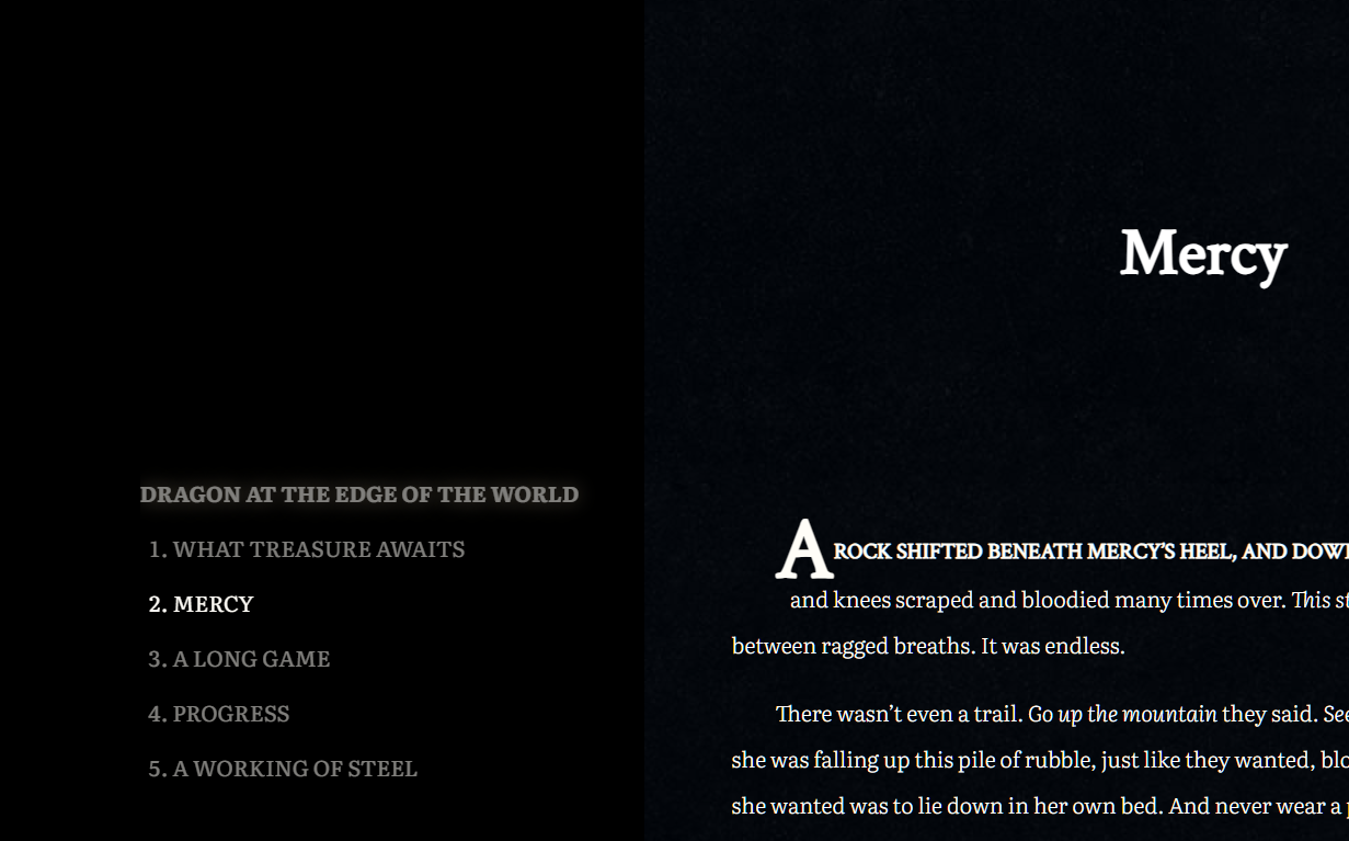
Which is all to say that I made a Google Doc viewer. Google docs, formatted for viewing. It automatically styles the document—we’re talking typeface, colours, line-height and text indent; titles, headings, sections, and styles for the first line and letter of each section.

It recognizes Google’s headings, titles and section breaks, but it also supports markdown style headings.

# Heading 1
## Heading 2
### Heading 3
#### Heading 4

It recognizes Google’s bold, italics, underline, and strikethrough, and it also supports some markdown styling.

_italic_
*bold*

And it automatically generates a table of contents (when applicable), which it to show your current position in the document.

2. Mercy is bold because that’s the section it’s currently scrolled to.

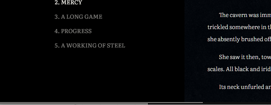
There are two progress bars along the bottom that reflect how far you are into the current section as well as the document as a whole.

And the best part is that if I change the Google document it automatically comes through to the viewer. I never have to share a raw Google doc again. I can link to read.gigglingcorpse.com instead.

Here’s a sample document—no table of contents though, since there’s only one heading in this document.

Posted on Programming

Alert system details

So…. I designed my own query and templating languages (along with associated editors and complete with syntax highlighting). It was definitely overkill, but it was fun and now I can define alerts any way I like: easy ones, complicated ones, whatever alerts I want. With integrated documentation and helper functions to assist with defining your queries. As I’m sure you can imagine, this post expands on TWIG Irrigation alerts.

Let’s take a look at the interface with an example query:

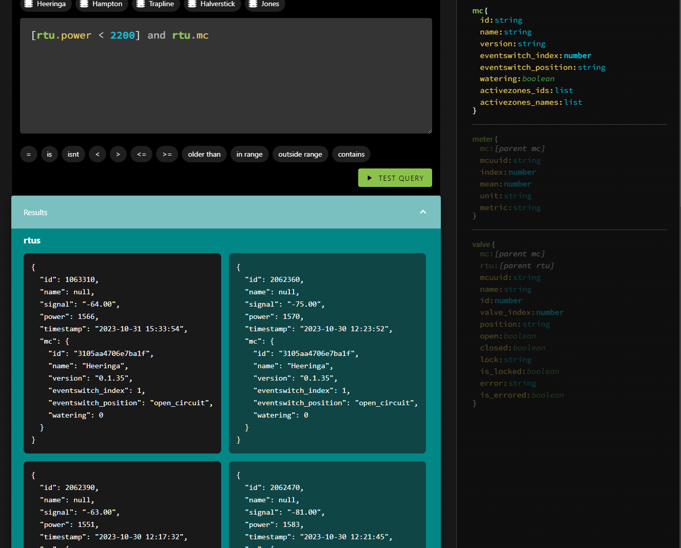
An alert for when an RTU is low on power

The cursor (which you can’t see) is at the end of the line—right after rtu.mc. On the right, there is a description of the available data objects. RTU is opaque (but its properties are not, though you can see its mc property is highlighted). The editor detects where you are and organizes the objects on the right, highlighting the relevant information. It’s why the entirety of MC is opaque. So if you want to deal with a field particular to an MC, you know what they are and their datatypes. You can either type it in, or click on the field there and it will insert itself.

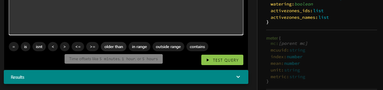
You can do a lot that way—just by clicking. The buttons above the trigger code block insert the MC IDs; each one represents a farm. The buttons below the trigger block insert the various conditionals you can apply.

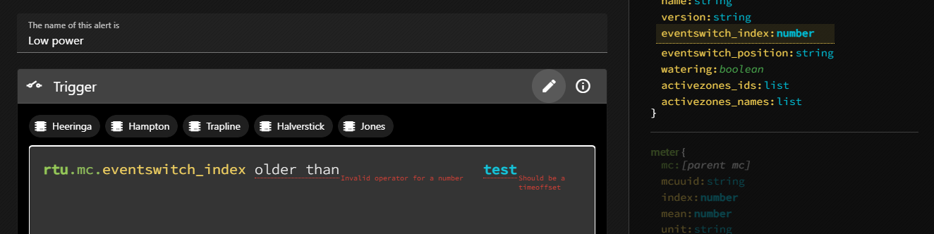
And of course there is error checking:

rtu.mc.eventswitch_index expects a number, not a string.
olderthan expects to be used on a datetime, and to be used with a time offset, not a string.
rt isn’t a valid primitive.
fake field isn’t a real property of an RTU.

To learn about the trigger definitions in even more detail, you can click the little i in a circle which will reveal the documentation in-place.

But what about the query that got us here? [rtu.power < 2200] and rtu.mc

The first section is pretty obvious (it will return true if an RTU’s power field is less than 2200) but the rest looks a bit weird. but let’s ignore that for now and get into testing a query.

If you test a query and the query has no results it means that there is no error, and so the alert won’t be triggered yet. That’s great, but it’s not very useful when you’re working on an alert. You won’t see anything in the results tray, so you won’t have any handy examples to show you the shape of the data you’ll be able to reference in the alert itself.

That’s what the square brackets are about. [rtu.power < 2200] means that when testing the query, the system will ignore this condition. So if there are no RTUs with low power, you’ll still see results in the tray. They’ll just have power higher than 2200.

But why and rtu.mc? That has to do with enriching the results.

In the returned data, sub-primitives are only filled in as necessary, but you may find yourself in a situation where you want deeper access. If the query were simply rtu.power < 2200 you’d get back all the fields of the RTU, but the MC object wouldn’t be filled in. Which is fine, unless we want to reference one of the MC’s fields in the alert message. So an easy way to fill it in is just to include it in the query without an associated condition.

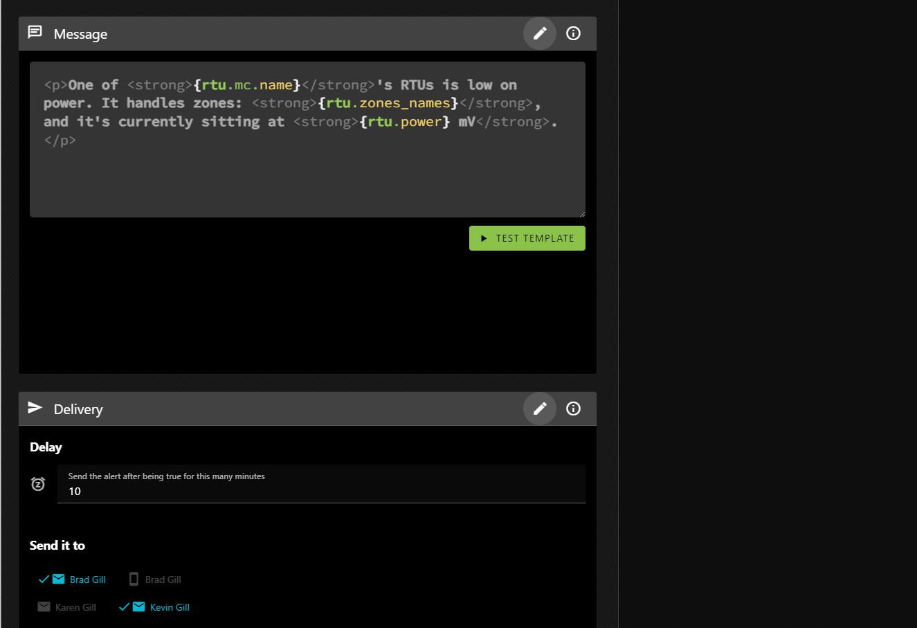
This is where you define the alert message and what happens when the alert is triggered.

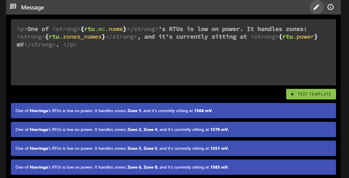
The message block is where you define what the alert will say when it is triggered. As you can see it allows HTML formatting, and you can insert values from the results. This message will be repeated, one for each result, all in a single message so you’re not bombarded with emails.

You can see that it references the MC’s name (the farm name), as well as the RTU’s power level. But it also includes a property not present in the results: rtu.zone_names.

Various primitives include helper properties (which you can learn more about by clicking on the i in the circle). rtu.zone_names returns the valve names associated with an RTU as a comma-delimited string, which can help you determine which RTU you’re looking for if you haven’t named it. In our case, the valves are often named for specific fields, but the RTUs are not.

The TEST TEMPLATE button will show you how the message will be rendered based on the same results TEST QUERY would generate.

And that’s pretty much it! Except that things can get much more complicated.

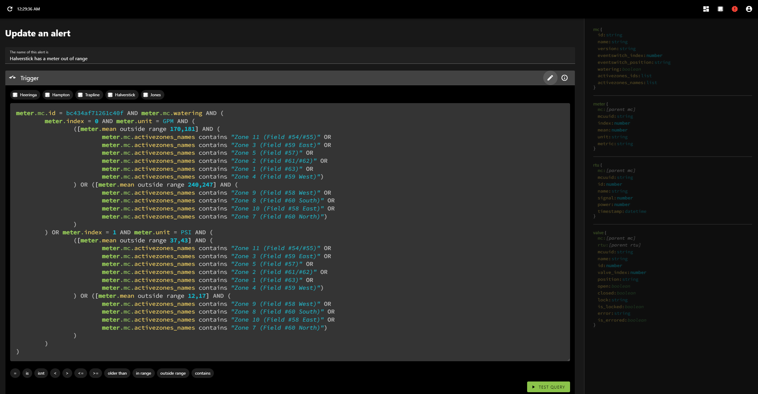
You may remember that in my previous post on the topic I mentioned that I analyzed the data and programmatically generated meter alerts for each farm? Let’s take a look at one of those!

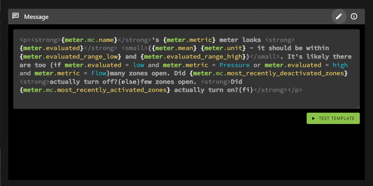
The data contains pressure and flow metres, and depending on the field we may expect different value ranges.

Oh, yeah, and the templating language allows conditional inclusion, where the conditions are evaluated using the same syntax as the query language.

Alerts aren’t re-sent until the system detects that they’ve been corrected. This means that if things continue to go wrong you won’t know, but also means that you wont’ have a bunch of cascading messages obfuscating what was most likely the root cause (the first error). That makes sense for something like meter range errors and it’s why I did all the metres for each farm as a single alert. That way you’ll only get one metre error per farm at a time.

It doesn’t make as much sense for errors that are unrelated (like the RTU power alert), but I can address that with an alert setting when and if it becomes an issue. It’s not overly important at the moment; since it can be currently handled by defining individual alerts rather than grouping them together.

Posted on Programming

TWIG Irrigation alerts

As you know, my brother is a farmer (via the professional poker player to farmer pipeline), but he doesn’t deal with just a single farm. No, he deals with many farms. Five, I think; and each one needs watering.

He uses the TWIG irrigation control system from Nelson. It’s great. He can set up irrigation plans and run them. He can even see what’s happening using their app… But only one farm at a time.

He wanted to see them all at once, so he contacted the company. They were very helpful. Travis got involved, suggesting (and vetting) various potential solutions, before mentioning something interesting…that they have an API, which they kindly gave us access to.

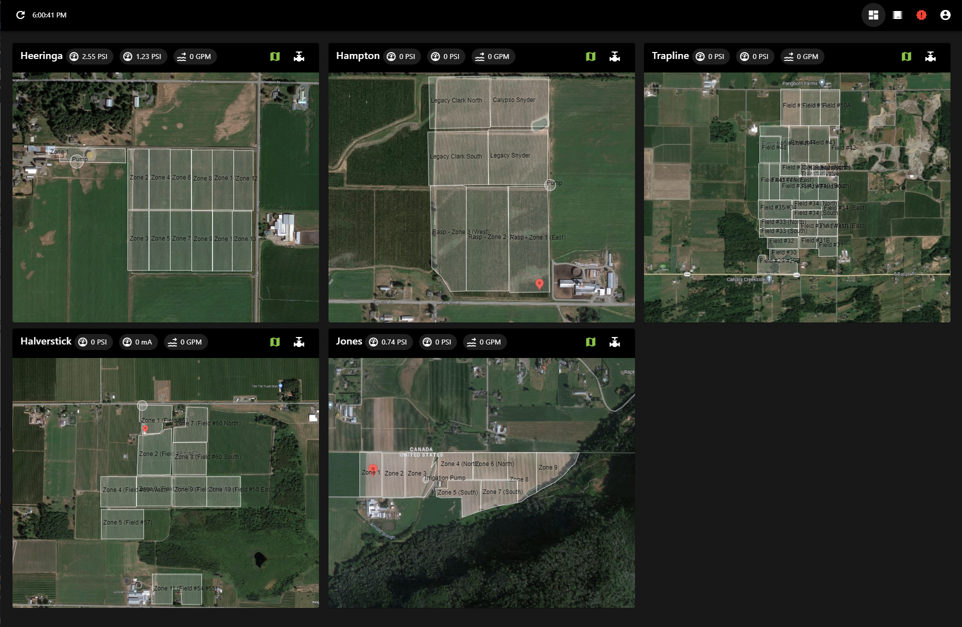
So I made it. A dashboard he can keep open on the office computer showing the current state of all things irrigation, across all the farms.

The map view of the farms

These screenshots aren’t the best example as they’re not actually watering right now, but those white boxes turn blue if a field is being irrigated, and they slowly fill as the watering progresses.

The valve view for one of the farms

He can see which valves are open, their signal strength and how their batteries are doing. There’s a chart view as well (when a irrigation plan is running) where he can see how far through the plan it currently is, what’s been watered and what remains to be watered.

Problem solved.

But, since I already had API access, he mentioned something else that would be useful: alerts.

So I built an alert system.

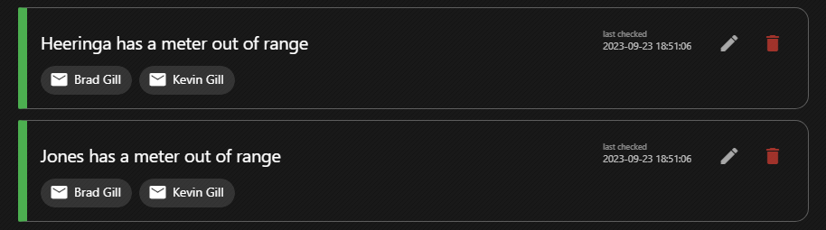
Green means everything is good. They change colour depending on their state.

It’s pretty cool. You can define arbitrary alerts—if a battery is low, if a pressure or flow meter is out of a certain range, if water is flowing when a irrigation plan isn’t running, etc. And since I was collecting all this data anyway, I recorded the meter values over a week or so and then ran an analysis to determine and auto-generate pressure and flow alerts for the different fields, at the farm level.

I might go into the alert system’s mechanics in more detail later, but for now let’s focus on things more interesting to people who aren’t me. Suffice to say that it’s perhaps a bit overpowered.

One of the neat things about these alerts is that, in many cases, information we’ve seen previously can hint at what or where something went wrong, and we can take advantage of that. If a pressure metre reads lower than expected, it’s probable that a valve didn’t close in the previous set of active zones. So it makes sense to check those fields first. And if you know that, maybe you don’t have to drive around to all of the fields checking that none of their valves are stuck open.

So when you get an alert like this—

Heeringa‘s Flow meter looks high (65.1 GPM – it should be between 33 and 53). It’s likely there are too many zones open. Did Zone 11 actually turn off?

—You immediately know you should check out Zone 11.

So, I mean, go check out Zone 11 or whatever. The valve’s probably stuck open.

Posted on crafting

A Kindle cover, made quite poorly

Have you ever fallen asleep with your kindle in your hand, only to be shocked awake when it clatters to the floor? No? Well, me neither, but I’m given to understand that it’s something that happens to certain people with some regularity.

So I got to thinking, and thinking always leads to drawing up some professional-quality diagrams. Wait. Schematics. Yeah, schematics. That sounds fancier.

Super clear and professional design schematics

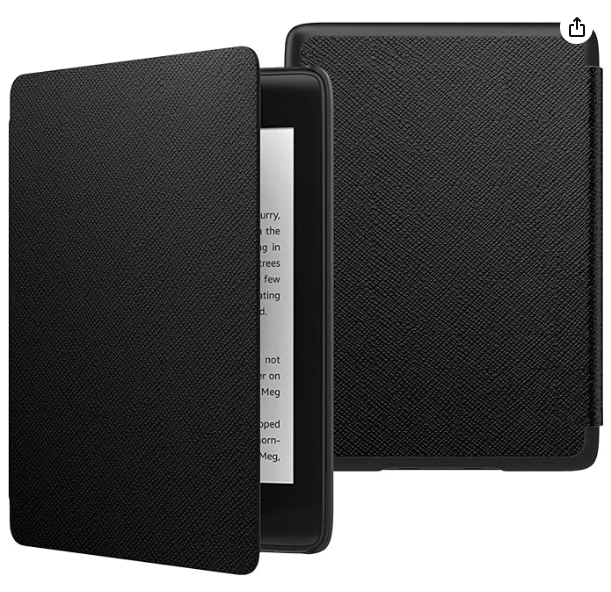
I considered 3D printing the part that connects to the Kindle, but worried it would be too brittle and eventually settled on ordering a very basic case from Amazon.

As I’m sure you immediately noticed, the cover flap hinges from the side, while the schematics very clearly require it to hinge from the top. So I broke out the trusty exacto knife and soon it hinged from nowhere at all.

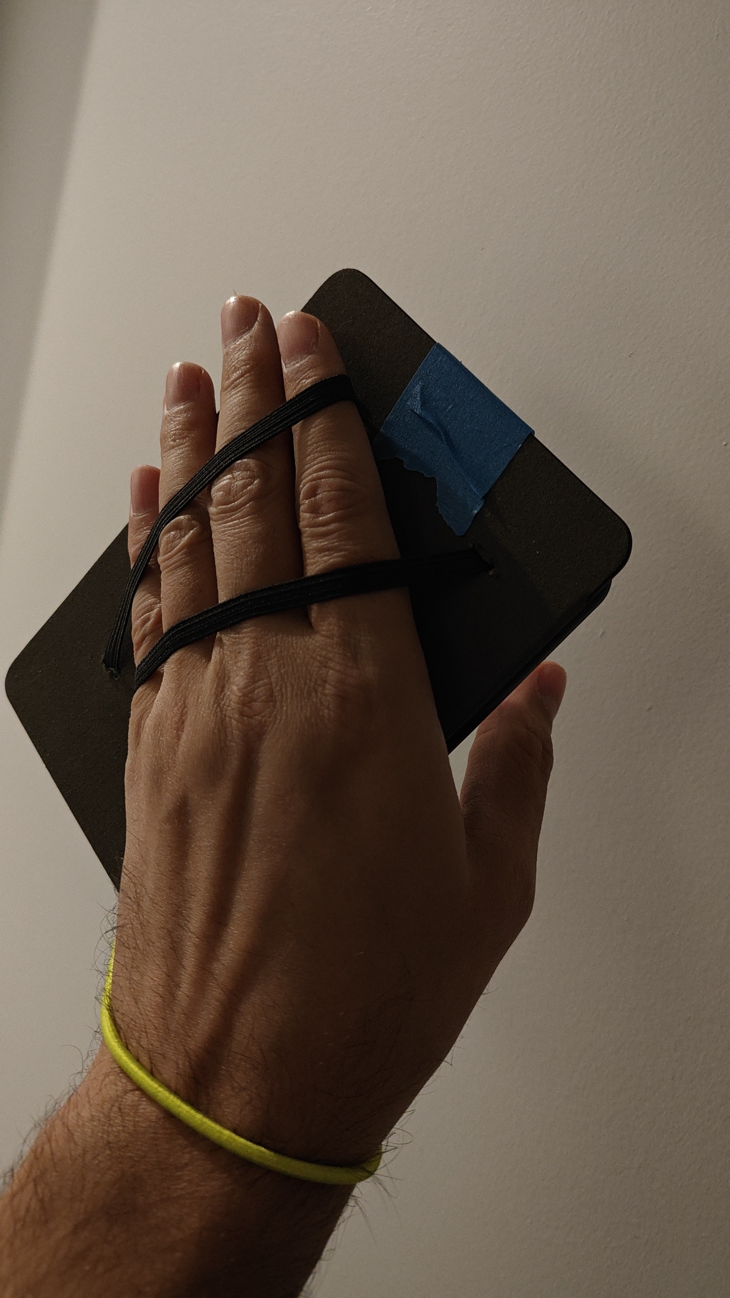
The next step, as per the schematics, was to add the hand-straps to the back of the flap. So, you know, I kind of did that. Not well, but… I mean they’re there.

Then I attached the safety line, for, you know, safety.

Why yes, that is duct tape over cardboard.

And I placed magnets in both sides to hold it together when it’s open. I should have formed a channel with them (this was the original plan), but instead I didn’t do that and the end product is all the worse for it. It’s all tradeoffs, you know?

Hand holders and a safety strap? Ingenious!

But there was no way to know if it would work…

I guess it works

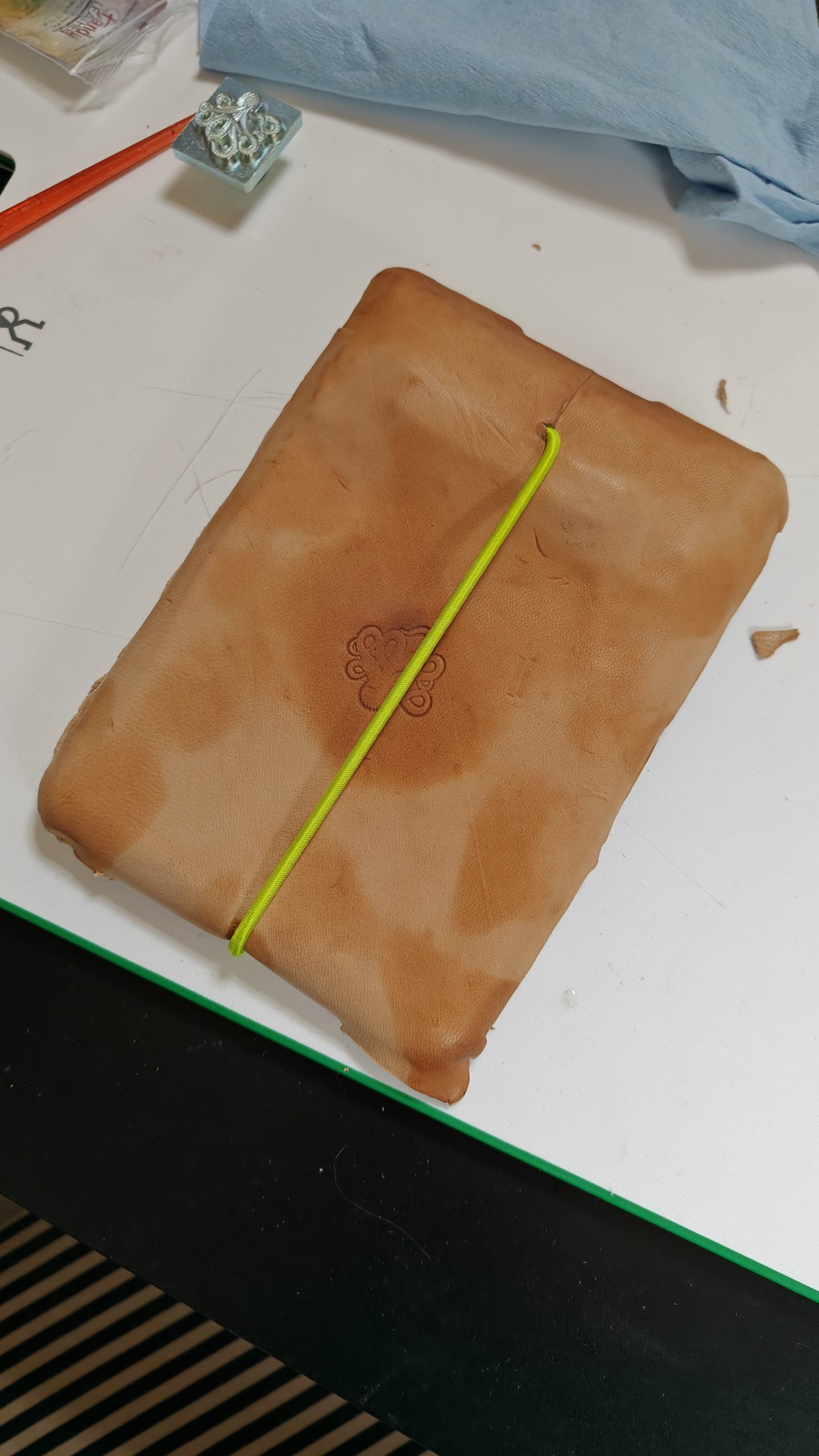
I know it looks awkward, and believe me, it is, but my hand is also larger than necessary. This is what we in the engineering game call “something about tolerances”. Also, please note that I am not, in fact, an engineer. However, as I’m sure engineers often say: it was good enough. Except, I guess, for the painter’s tape forming the hinge. That certainly wasn’t going to hold up, so I did a very bad job wrapping the whole thing in leather.

And then I also quite a poor job staining it.

And there you have it!

Is it nice? No. Is it functional? No. Okay, I guess it is. Is it safe? Sure, if used correctly.

Posted on crafting

I made a cat toy

Why, you ask? Well, it was Christmas time, you see. Yes, I know that’s how these stories always start, but that’s the way it happened. Everyone was watching football and there were cats everywhere. A dog too, but was outnumbered and he knew it.

This isn’t all of the cats that were there.

By sheer happenstance, in an adjacent room, rolls of leather rested against one wall, and right next to them were basic leatherworking tools. Now, I know what you’re thinking. You’re thinking: Brad, that’s a normal thing. All of these are normal things. Why are you wasting my time with this? Well, sure, maybe it’s normal—I have not once claimed to be an authority on what’s normal and what’s not—but at the very least I would content that I have little to no control over your time. That’s on you, my friend. Now, if I can please get back to my story? Thank you.

Well, I guess I made a quick cat toy. Out of leather. That’s pretty much it.

This is a cat toy, I guess.

As I mentioned quite recently it is made out of leather. I shaped the two halves over a little wooden ball (which was part of another cat toy), and then stitched them together. I stuffed the whole thing with some… I dunno, stuffing? Whatever the stuff you put into things is called… And added some catnip.

I would have liked trap a bell inside, but I didn’t have one handy.

It’s very light and irregular in shape, so when a cat hits it it moves easily and in a manner difficult to predict. All of which was very intentional; definitely not a product of its poor production.

I am tempted to make another though, this time with a bell in it.

Posted on Travel

Dealing with photos

There’s nothing worse than traveling with a smartphone. Sure, you might not have to worry about a few inconveniences (getting lost, printing things like tickets or booking confirmations, or knowing what time it is), but you assuredly come back with way too many photos—sometimes numbering in the thousands. And then you have to sort through them all. I’m not even talking about good photos.

No, there’s nothing worse than traveling with a smartphone (actually maybe hiccups).

At some point—I think around May 2023—I found myself in this exact position once again, and honestly, I should have known better. But there I was with a million1 or so photos from France, and so that’s when I finally gave up, and just made a program to help me sort them.

I warn you now: it is ugly and unpolished, but for my purposes it gets the job done.

That’s right, I didn’t bother changing the form’s title from Form1. So what??

You can select the parent folder to look through. It will load in any metadata its already saved and detect the folder structure, which it’ll use to overwrite any contradictory metadata (which I’ll explain more in a bit).

The scale tags are set, but you can select which one(s) you currently want to view. As you move through the photos (with the left and right arrow keys) you can click up to raise the photo’s scale, or down to lower it. So I can quickly toggle through all the photos and mark the blurry ones as terrible.

Then I can go through the the remainder and decide if I like them or not.

I can also add custom tags and apply them to photos, which I did this for my photos from France.

This one is tagged with best (a scale tag), as well as eze and wildlife (custom tags)

You can update an image’s tags by right-clicking on it.

A photo can only have a single scale tag associated with it because… that’s kind of just how scale works

The Save button saves the current metadata to a JSON file, but Bake scale bakes the scale into the folder structure. This creates directories in your folder for each scale tag that currently has images associated with it, and moves those photos into that subdirectory. Which means I don’t have to rely on being able to find this program later to know which photos were okay. Which is great because I lost it once already. Well, first I completely forgot it existed, but when I realized and went looking for it I couldn’t find it anywhere.

But I have found it now, and I guess I should use it to organize my photos from Germany. Ugh.

Posted on Travel

France 2023

Way back in April we went to France for my birthday. The airport was a mess in Paris and it took three hours to get through customs. Our connecting flight was delayed, but since we had bags to check it was too late to get them on the plane, which meant we had to book another flight to Nice, conveniently more expensive than the first.

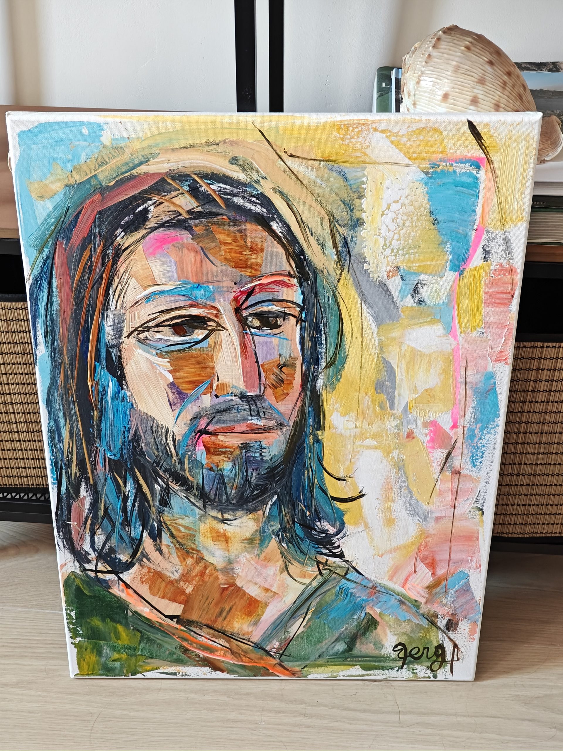
For five days we stayed there, day-tripping around. On one of those days we hiked up to Eze, where I got my portrait painted by @artberga. Packing it up and mailing it to Canada was a bit of a thing, but it made it!

Here it is in our AirBnB in Nice

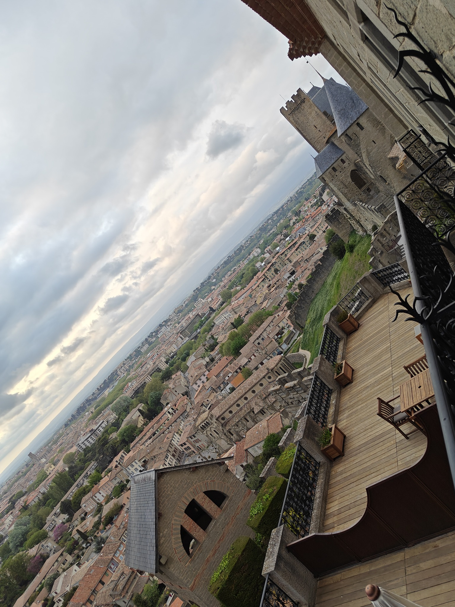
When Justin arrived from Cambridge, we road-tripped around the south of France for four days. The first night, we stayed at the Hotel de la Cité Carcassonne, which was maybe the nicest building I’ve ever been in. It was awesome there, and the view was neat.

The view from our balcony

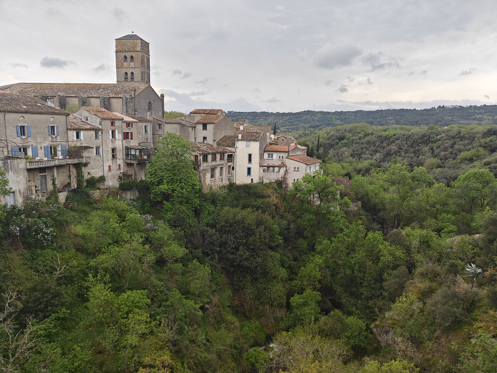
Then we went to Montolieu: a small town with a lot of bookstores. We stayed in Narbonne that night.

Montolieu

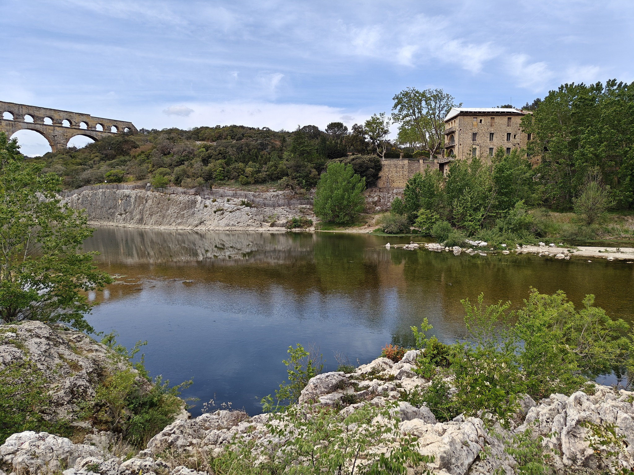
The next day was Nîmes and surrounds.

On our way back to Nice, we stopped in Cassis to boat some calanques. It was a bit windy, which cut down on our options. Still, it was pretty awesome.

Our trusty boat

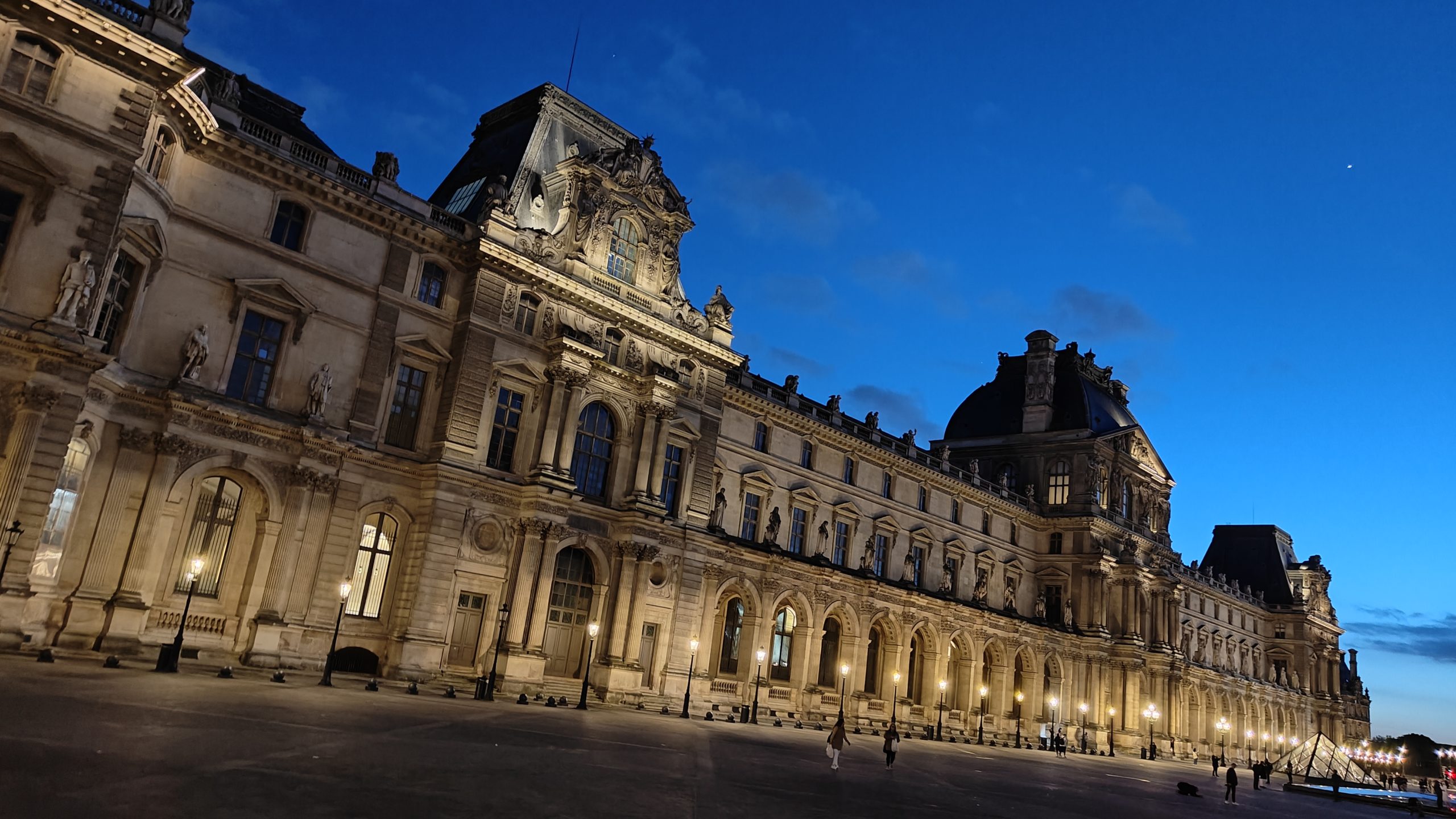
The next day we took the train to Paris to meet Josh and Chelsea. For the next eight days, we stayed in an AirBnB a block from the Louvre. It was wildly convenient, and the bedroom was built directly above the kitchen of a boulangerie. Every morning at around 5am they’d start pumping the dance music.

I didn’t hate it.

What followed was seven days (Josh and Chelsea left a day before us) of friendship, fancy food, and drinking champagne—where we also went, on a tour guided by JB, who I heartily recommend (we occasionally still WhatsApp about books we’re reading). I would definitely go on another.

this is a louvre

Posted on Programming

Imposition

Sometimes when all you know is cold plastic against your fingertips, you get curious about other things. Things that aren’t programming. Your hands go clickity-clack against the keys all day and you wonder, is it the same for everyone? Do they suffer the same joys and frustrations I do? How do they plan and what are their processes like?

So you watch some Youtube videos.

And you start to wonder what knowledge they have built up, through years and experience, that they would gloss over when describing what it is they do because it’s just so ingrained. Things you would traditionally pick up piecemeal, and wouldn’t necessarily think of as a novice who doesn’t understand the questions that want asking. Or maybe they don’t even know why they do certain things past the unsatisfying answer tradition.

You find yourself wondering: if you watch enough Youtube videos, will you see the process from enough angles to pick out some of those tripping points experience runs smooth?

These are the sort of puzzles that leave your monitor a tangled nest of queued videos and Google queries, and a small voice in the back of your mind starts to whisper at you: wait, is this just programming again?

For me, most recently, this has resulted in what any reasonable individual would objectively deem as too many book binding videos.

What the heck, 8.5×11″

I thought I was starting to build up a high level understanding of it—at least enough to recognize words like “signature” and “tail”, and the existence of something called paper grain—and then I found a gap I just didn’t understand how people navigated.

The only paper that seems readily available is 8.5×11″. The type of paper an everyday printer uses. There must be other papers, but how do people find them? Moreover, how do they print onto them? Do they do it themselves or have specialized printing companies do it for them? It certainly seemed like many videos I watched ended up constructing books of blank pages. But surely that wasn’t always the case. I mean, I’ve read a book before. Quite famously, those things have words.

In real life, I imagine this is the sort of question you could just ask someone. But real life is a dangerous place, full of sentence fragments, curly brackets, and semicolons. I am a child of the internet.

No, best not to venture there.

Maybe it was all 8.5×11″ printer paper. And if it wasn’t (it almost certainly wasn’t), I imagine it theoretically could be. It’s not like I was actually doing any book binding. Problem solved.

Which, as solutions often to do, led to a new problem of its own. Sure, you could fold an 8.5×11″ along the long edge and end up with a roughly page-shaped rectangle, but as far as I could tell most 8.5×11″ sheets’ grain went along the long edge. Which would result, after the fold, in the grain going along the short edge of of your page.

From my meticulous research (watching some Youtube videos), it seemed that this was far from ideal. Paper it seems, bends easier in the direction perpendicular to the grain (so the grain fibres aren’t being bent). Apparently folding it the opposite way can even crack some cheaper papers, and having the grain in the right direction (vertically) can impact the longevity and feel of the book—this is my possibly incorrect understanding, anyway. If the grain is aligned correctly, the expansion and contraction of the paper and the tendency to bend a certain way don’t work against the integrity of the spine quite as much, and the pages turn more easily since that is the way the paper likes to bend.

So what the heck, 8.5×11″.

The internet suggested to me that one possible solution is buying a ream of 11×17″ and cutting it in half to a short-grained 8.5×11″. But I was intrigued instead by the thought of cutting 8.5×11″ down to 8.5×5.5″ and, after the fold, ending up with pages that are 4.25×5.5″.

This would mean that on each sheet of 8.5×11″ you’d have 8 pages when printed double-sided.

As a potential solution it seemed reasonable enough, and for a moment I thought maybe I could move past the whole thought experiment, but then I started to wonder how one might actually accomplish that… How would you lay out the pages appropriately so everything printed correctly?

It turns out this process is called imposition (I think), and that both InDesign and Acrobat didn’t solve my particular problem. They could do it, sure, just apparently not in strangely specific the layout I wanted.

So I wrote a script for it, and discovered that maybe this was just programming after all.

I can make that

And as things so often do, everything eventually circled back to the ol’ trap of – I can make that. So I made an imposition script in Python which takes a PDF and generates a PDF, and it seemed to work. I also came to realize that I very much did not like Python’s PDF libraries.

At the same time something else occurred to me. Often in videos I would see an angled line drawn across the back of the book block to provide a visual indicator that all the signatures were in the right order. It left a little mark on each signature (possibly why they’re called signatures). But if I was assuming double-sided printing anyway, I could just generate those marks as well and print them along with the text.

So I rewrote the whole thing in PHP, and added that to it.

Maybe this is common practice. I don’t know, I’m not a book binder! Besides, I don’t actually have a printer, so who knows if it works. Maybe it does, maybe it doesn’t. There’s no way to find out, and maybe we’ll never know.

Coincidentally, writing it in PHP made it easy to put a web UI over it, and maybe it’ll be useful to someone.

If you want to give it a try, head on over to https://gigglingcorpse.com/dev/imposing or just scroll a bit further. If you do print, fold the long edge and then the short edge. With a signature size of 2, and rotate the bottom half set to true everything should align like pages in a book. You’ll still have to cut the page in half, but that seems like a problem easy enough to get around.

This was actually from May, 2020, but I never posted it...
Posted on Art

Risk of Rain 2 (intro and outro)

It was immediately clear to me that something was missing in my new career as a professional streamer. And, no – I know what you’re thinking – it wasn’t a dedicated following full of enchanted viewers. Chasing viewers is for people who don’t already have them, and I have a well-deserved zero, thank you very much.

It wasn’t skill.

No, what I was missing was something to take the edge off the jarring starts and stops that wrapped each stream – and I knew just what to do.

The first step was to figure out how on Earth to use After Effects. Whether I succeeded at that remains hotly debated, but I did manage to cobble together an intro video.

Realizing only then that future streams would feel unacceptably lopsided, I panicked and threw together a quick closing video as well.

Please enjoy with my blessing.